Legal & General
Bringing your pensions together
A decision guide for anyone with more than one pension pot.
Spatial Sites / MicroSites
We turn pension guides, benefit booklets and member communications into accessible, interactive microsites built for large organisations and the people they serve.
The idea
Step 2 of 5
What goes in each month
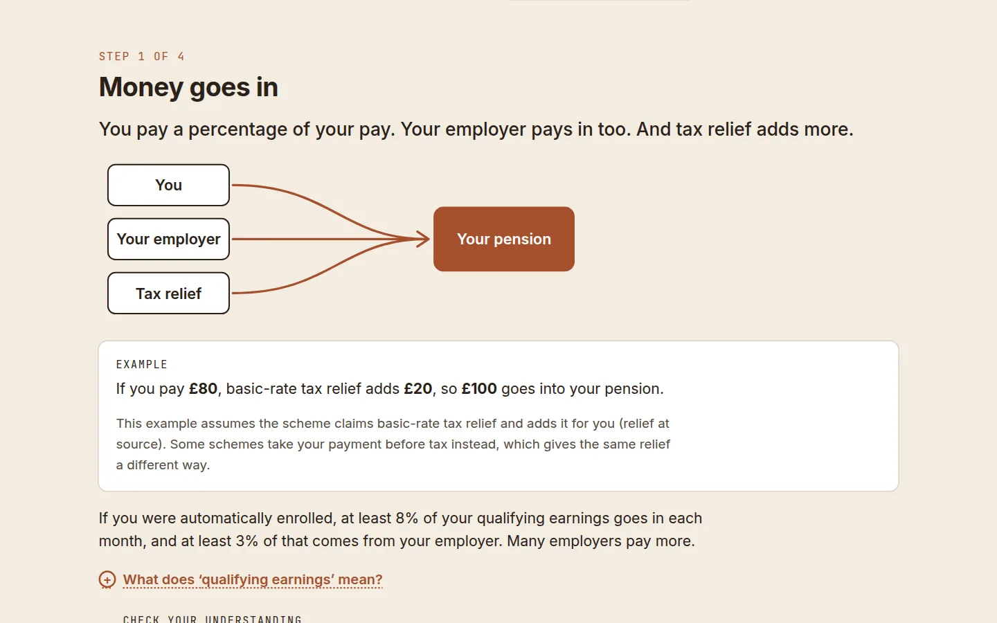
You pay a percentage of your pay, your employer adds more, and the government adds tax relief.
If you pay £80, tax relief adds £20, so £100 goes into your pension.
Tax relief Money that would have gone to the government as tax, added to your pension instead.
Next: check your payslipWhy a microsite
Pension providers, insurers, administrators and employers publish a great deal of information people genuinely need: how a scheme works, what a statement means, what to do when life changes. Much of it is versioned for different employers, schemes or member groups.
A microsite can take someone straight to the parts that apply to them, explain unfamiliar terms where they appear, and finish with a clear next step. The same foundation can then be adapted for each client, scheme or campaign.
Plain language, useful interactions and a route through complex decisions.
A reusable system that adapts to different clients, schemes, campaigns and content updates.
Fast, accessible, measurable journeys with a clear next step.
Live demos
Independent Spatial Sites concepts. None is commissioned or endorsed by the company it is for. Names identify the public information each study responds to.
Legal & General
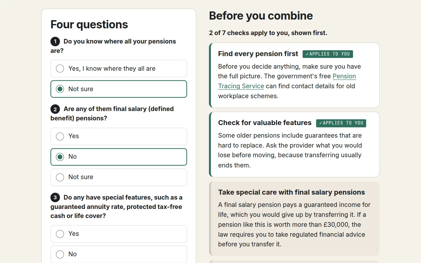
A decision guide for anyone with more than one pension pot.
Standard Life
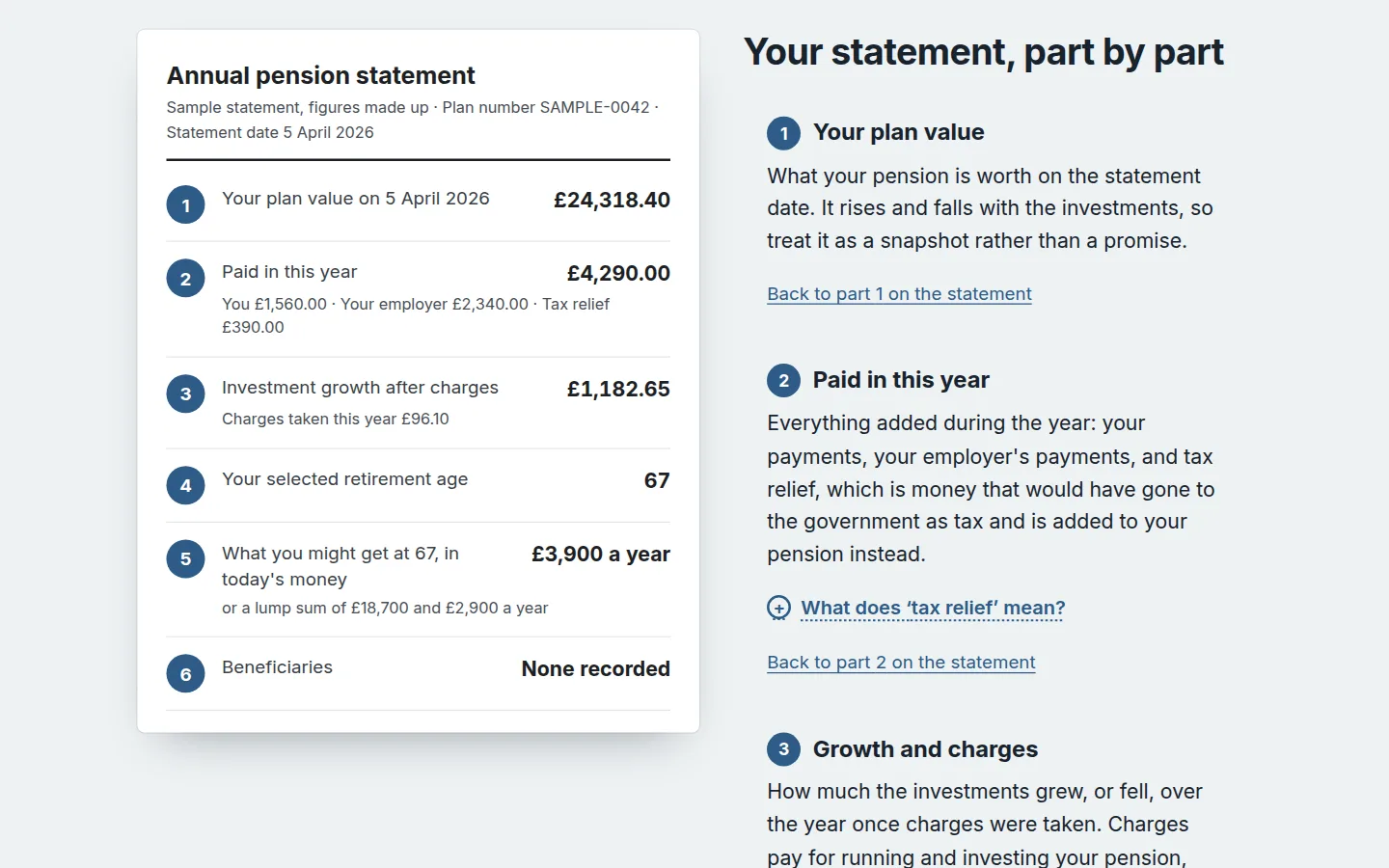
A sample statement with every part explained beside it.
Royal London
A short learning journey with a quick check at each step.
Unum UK
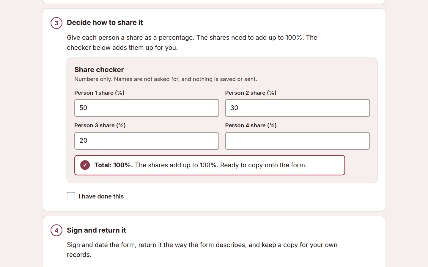
A calm checklist for telling trustees who you would like to benefit.
Browse
Each company has five different concepts, not five colour schemes. Live demos are marked. The rest are concept directions, published as their demos are finished.
A decision guide for anyone with more than one pension pot.
Five short chapters for someone who has just been enrolled.
Published living standards, made easy to compare.
Every member campaign in one place, ready to send.
Follow one pound from your payslip into the fund.
A sample statement with every part explained beside it.
What changes on your payslip, shown with worked examples.
A checklist for naming, and updating, the people who matter.
The main options compared on one clear page.
The moments in a year when a pension is worth a look.
A short learning journey with a quick check at each step.
Straight answers to the doubts that stop people saving.
What starting five years later can mean, shown simply.
Three steps to tracking down a pension from an old job.
A short film with chapters, captions and a transcript.
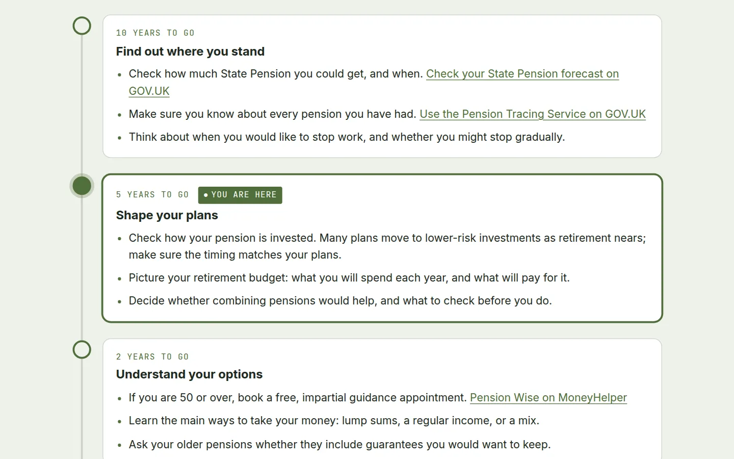
What to do, and when, in the decade before you stop work.
Twenty minutes to see where your pension stands.
What happens to your pension when work changes.
Five realistic approaches, and the signs that give them away.
Pension or other savings: what each is for.
A calm checklist for telling trustees who you would like to benefit.
What the cover is, who it protects, and the one thing to do.
An income protection claim, step by step, for you and your manager.
Find the help included with your cover, by what you need.
What it is, how a claim works, and where to find the detail.
What a microsite can include
One idea at a time, with the detail a click away.
What to gather, what to do, ticked off as you go.
Questions that bring the points that apply to the top.
Worked examples with their assumptions written beside them.
What happens when, and what to do at each stage.
Answers found in the reader's own words.
Captions, transcripts and chapters as standard.
The questions people actually ask, answered plainly.
The right contact, form or service at the end of every journey.
A project can include content strategy, design, interactive tools, implementation, accessibility testing, analytics and ongoing content updates. Scope and price are agreed through a conversation.
Built for every reader
Accessibility is part of the design, not a check at the end. These are the commitments every microsite we build starts from.
We describe a microsite as meeting WCAG 2.2 AA only once it has passed all four. Until then, each concept page says exactly which checks it has had. The standard is the W3C's Web Content Accessibility Guidelines 2.2, the same level the GOV.UK accessibility requirements set for public sector sites.
Made for your organisation
Built in your approved typefaces, colours and imagery, or a sub-brand for a campaign.
Shaped from the guides and materials you already have, with your subject experts.
Review stages and sign-off points agreed at the start, so compliance and legal review fit the plan.
Hosted where you need it: with us, on your infrastructure, or handed over to your team.
Routine changes handled by us or by your team, without a rebuild.
Delivery
Corporate communications pass through content, brand, compliance, accessibility and IT before anyone sees them. We make those steps part of the build.
Show the journey early with a working prototype. Give stakeholders clear review stages and agreed sign-off points.
Start with a reusable foundation, then adapt the approved branding, content, scheme details and interactions for each client.
Shape existing guides and support materials around the questions people actually have. Keep subject experts involved so the simpler experience stays accurate.
Design for keyboard, screen reader, low-vision and reduced-motion use from the beginning. Target WCAG 2.2 AA and test each finished microsite before making accessibility claims.
Agree the hosting, ownership, review and update process as part of the project. Make routine content changes manageable after launch.
Define the visitor's intended task, give them a clear next step, and measure where they succeed or need more help.
Bring us one document, one audience and the problem it needs to solve.
ContactProcess
A short conversation about the information, the audience and what success looks like.
We map the questions people have, agree the journey and show a working prototype early.
Design, content and interactive tools built on a reusable, accessible foundation.
Your subject experts, compliance and accessibility checks at agreed sign-off points.
Live on agreed hosting, measured against the intended task, and updated as things change.
The concepts on this page are independent Spatial Sites studies. They are not commissioned or endorsed by the companies named, and use no company logos.